
Occasionally we will get asked to print a piece of art that just doesn’t look right. Sometimes it is crooked, off-set, un-balanced, or one of any number of issues. We are here to give you some suggestions on how to turn awkward art into a thing of beauty! A true Cinderella story.
We are going to start with the state of Minnesota, one of the pioneers of mis-matched weight. This state features a full bodied left side, and a right side marred with inconsistencies, seriously what’s the deal with those two jutting book-ends… awkward!
Let’s begin…
THE STANDARD STATE
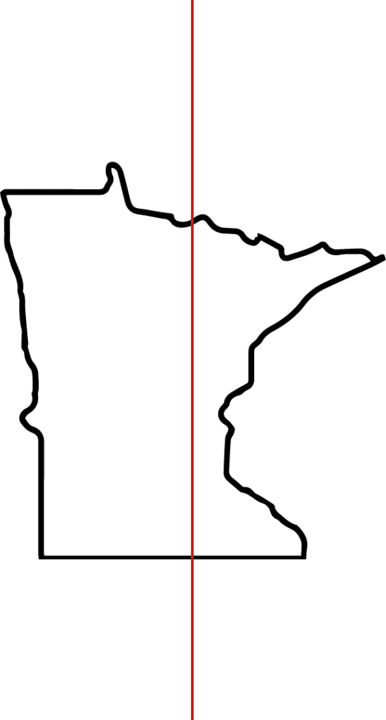
Let the guiding lines show you just how off-centered Minnesota is when it is “perfectly centered”. It may not look too bad right there on its own, but on a T-Shirt, you deal with an ocean of blank space on the right when you place the art in the middle. If you try to off-set the blank space by moving the print to the right, the top right point begins to tickle the armpit. Not good. Moving on…
THE FAT STATE
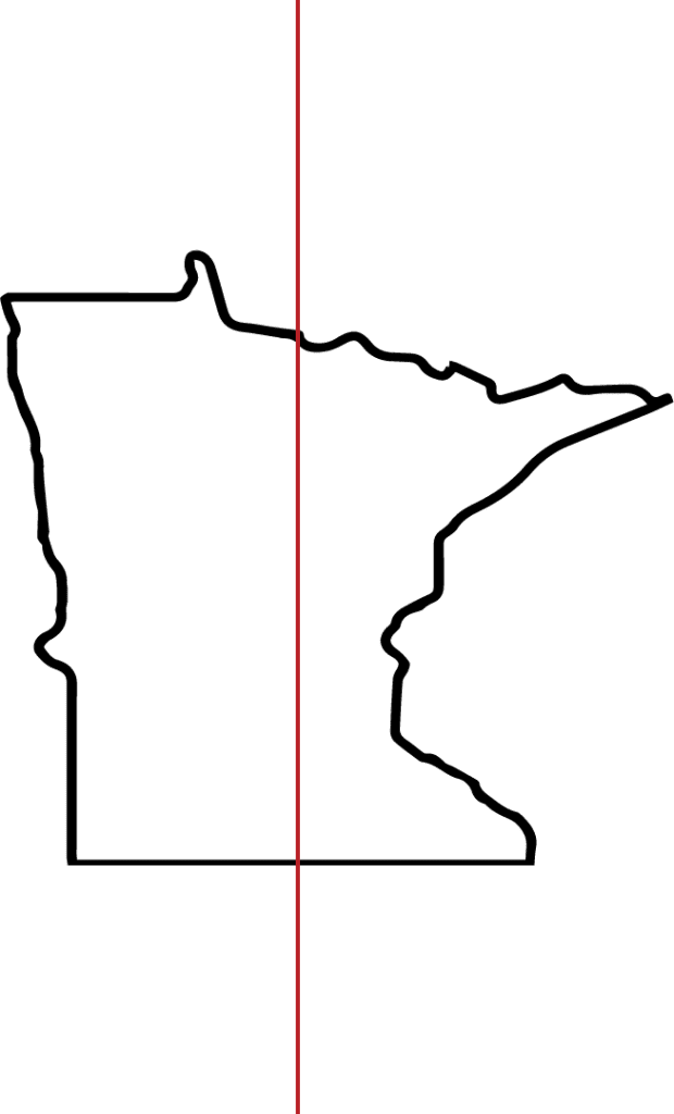
So you say to yourself, easy fix, fatten the state a little bit so the centering make a little more sense. While this is one way to make the overall design look a little more uniform, there are still two problems. 1. The state still looks slightly off, much less than the standard design, but still, not quite perfect and 2. You run the risk of turning people from “Minnesota Nice” into “Minnesota Mad” after messing with the shape of “home”.
Let’s try again…
THE SHORT ARMS STATE

We got it. This is the one. Shorten the arms on the top right and bottom right so they don’t go out so far, right? Nope. Still awkward. It works, but it’s not ideal, and didn’t we just talk about not messing with people’s states?
Let’s try some options we’ve found to be effective, and keep the design looking uniform and true.
THE TEXT FILLER STATE
Text! No better way to fill in awkward white space than with some text, but it doesn’t have to be text. You could try other fills such as lines, dots, loons, birds, waves, cheese (because… Wisconsin), etc. Take that awkward gap and say “goodbye gap!”. Also, have you noticed how much it looks like a face on the right side of the state? Give it some eyes and a mouth and you’ve got a complete design. One more option…
THE BOXED-IN STATE
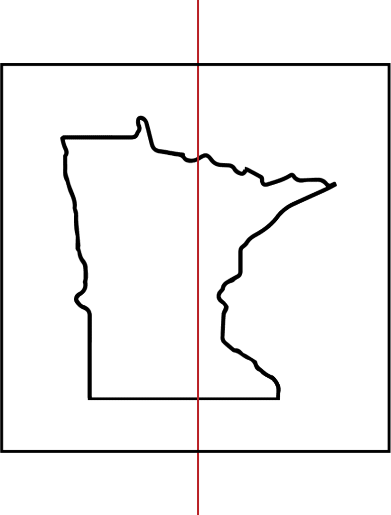
Box in the awkward. Trust us, keep that thing locked up. Tighten the whole design with a uniform, perfectly centered box. What this does is draw the eyes around the whole design and it looks GREAT on a Custom Screen Printed T-Shirt.
These are ideas and suggestions on how to turn awkward art into a T-Shirt design that is easy on the eyes. If you like in North Dakota, Wyoming, or Colorado, congrats. You have no issues with your perfectly shaped states. We’re all happy for you. For the rest of us, let’s get creative with how we size, shape, and fill in the canvas. Get to work! And for all your screen printing needs, feel free to ask us for help!